Imbalance Price Visualization
Plotting using matplotlib.
This post is part of a series applying machine learning techniques to an energy problem. The goal of this series is to develop models to forecast the UK Imbalance Price.
- Introduction - What is the Imbalance Price
- Getting Data - Scraping the ELEXON API
- Visualization - Imbalance Price Visualization
Visualization is a crucial first step in data analysis. In this post we use the visualization library in the forecast Python package. The notebook where this work was done is here.
The dataset was downloaded using the script forecast/projects/elexon/data_scraping.py and cleaned using the script forecast/projects/elexon/cleaning_data.py. All the functions I used in this post come from the visualization module of the forecast package.
The dataset has three variables - the Imbalance Price for the excess and insufficient balance and the imbalance volume. The Imbalance Price ranges from -153 to 3,000 £/MWh.
A good start for time series visualization is to simply plot the series. I do this using the plot_time_series function from the forecast library.
plot_time_series(elexon, 'Imbalance_price [£/MWh]', fig_name='time_series.png')
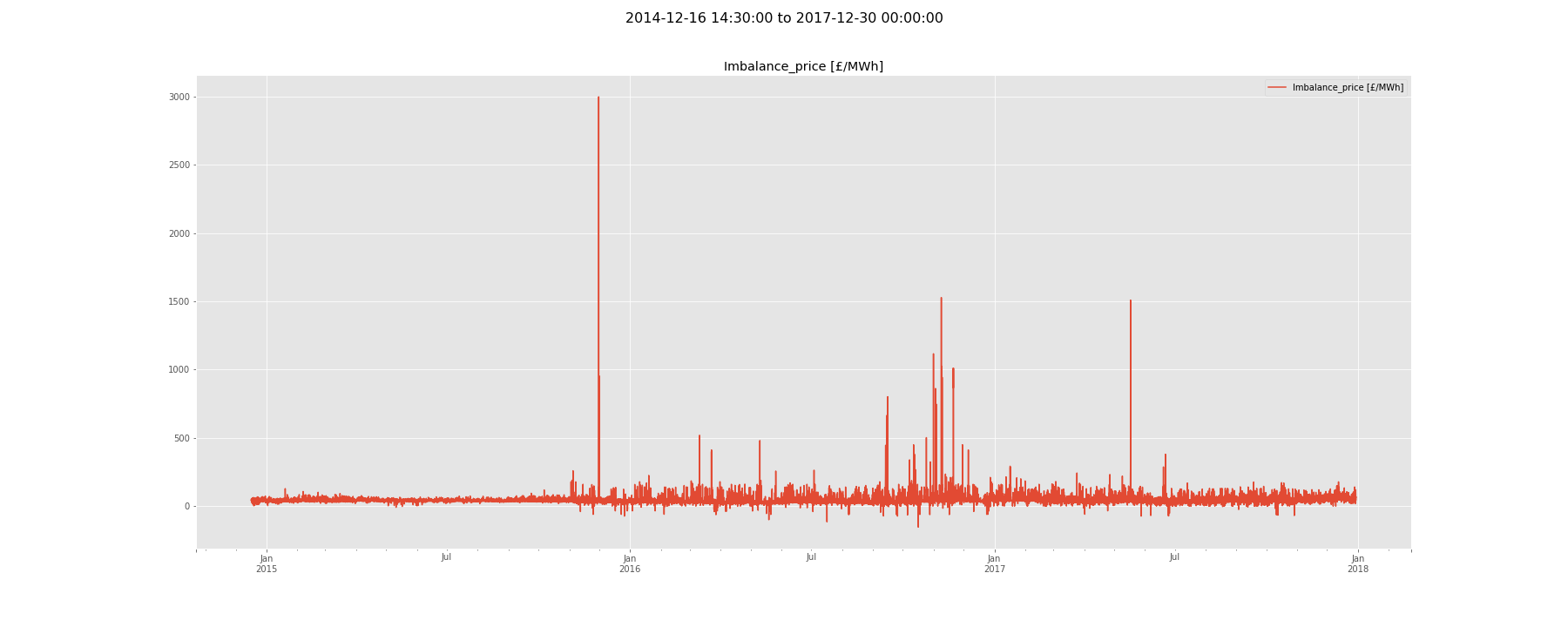
Figure 1 - A plot of the Imbalance Price from 2015 to 2017
We can also just take a look at 2017.
plot_time_series(elexon.loc['2017-01-01':, :], 'Imbalance_price [£/MWh]', fig_name='time_series_2017.png')
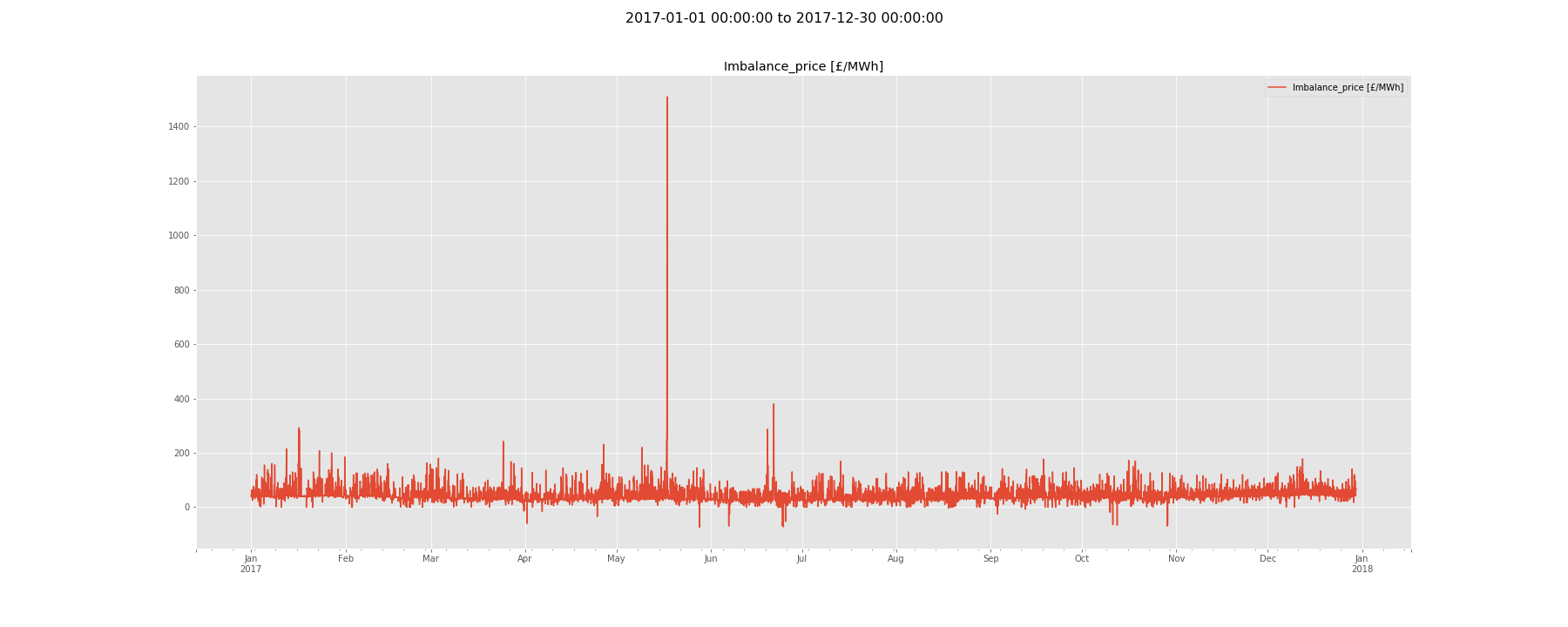
Figure 2 - A plot of the Imbalance Price in 2017
Next we look at how statistics such as mean, median and standard deviation have changed over time. We use the plot_grouped function to show how these statistics change month by month.
plot_grouped(elexon, 'Imbalance_price [£/MWh]', fig_name='figs/year_month.png')
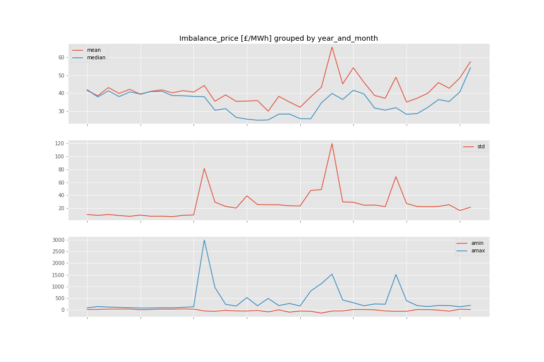
Figure 3 - Monthly statistics of the Imbalance Price across 2015-2017
This function can also be used with different grouping. In Figure 3 we can see how the prices changes for each month.
f = plot_grouped(elexon, 'Imbalance_price [£/MWh]', group_type='month', fig_name='figs/month.png')
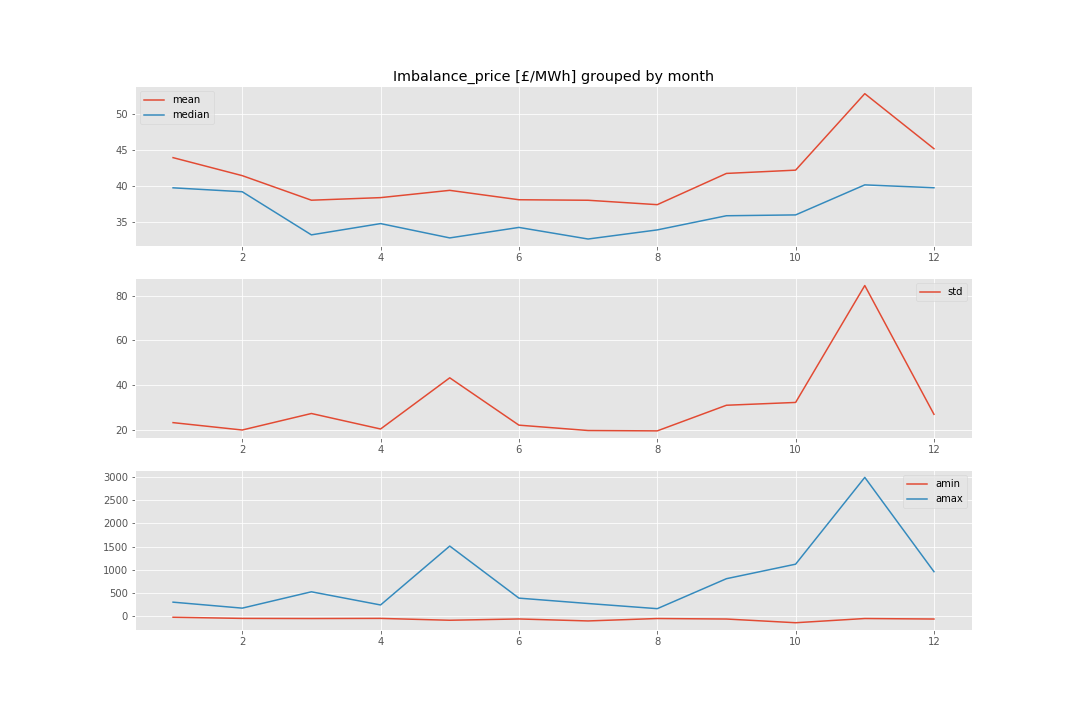
Figure 4 - Monthly statistics of the Imbalance Price across 2015-2017
Figure 4 shows some seasonality - the price tends to be higher and more volatile in the winter and lower in the summer. The higher level of the price is expected - in the UK demand peaks in the winter.
The plot_grouped function can also be used to show how the price changes across the day - shown in Figure 4 below.
plot_grouped(elexon, 'Imbalance_price [£/MWh]', group_type='hour', fig_name='figs/hour.png')
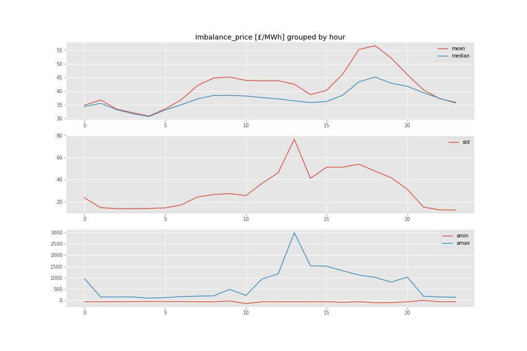
Figure 5 - Daily statistics of the Imbalance Price across 2015-2017
Figure 5 also shows seasonality - this time on a daily basis. Interestingly the price is most volatile in the afternoon - although it is likely that an outlier is distoriting this (seen by the maximum price also occurs in this time period).
It can also be useful to look at the distribution of time series. Figure 6 shows a histogram and the kernel density plot of the Imbalance Price.
plot_distribution(elexon, 'Imbalance_price [£/MWh]', fig_name='figs/distribution.png')

Figure 6 - Histogram and kernel density plot of the Imbalance Price
Finally we can take a look at the autocorrelation and partial autocorrelation of the Imbalance Price. Autocorrelation is the correlation of a variable with a lagged version of itself - spikes in autocorrelation suggest seasonality. Partial autocorrelation measures the degree of association between the variable and a lagged version of itself, controlling for the values of the time series at all shorter lags.
plot_autocorrelation(elexon, 'Imbalance_price [£/MWh]', fig_name='figs/acf.png')
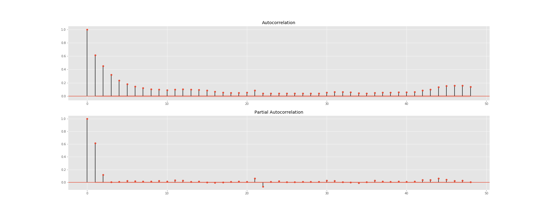
Figure 7 - Autocorrelation and partial autocorrelation of the Imbalance Price
We can see that the majority of the autocorrelation exists at lags two and three, with some small amounts at 12 and 24 hours.
Thanks for reading!